 Tempo - by Castos
Button
Types of Buttons
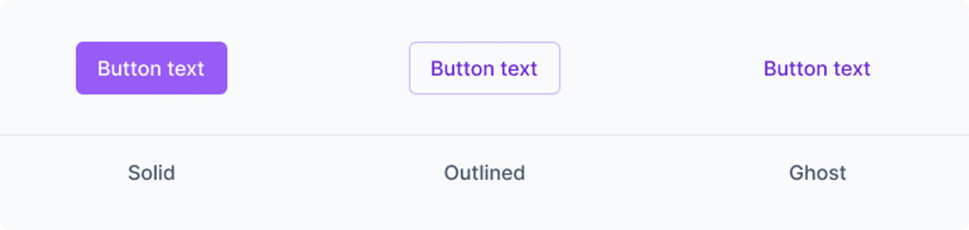
We have 3 types of buttons, for:
- Solid → The button contains a fill color.
- Outlined → The button has no fill, but is outlined to denote it's boundaries.
- Ghost → The button has no fill or outline, and appears to be text only.
Variations
There are 4 variations of buttons in Tempo. Each demanding a different level of attention, and should be used with that in mind. A primary action on a page (e.g. Save) should get the primary button, while a secondary action (e.g. Cancel) should get the secondary treatment. As well as some other variations depending on the need.
We need to combine the type of button with a variation to get the full button component.
Below is a further explanation on the types of buttons and how to use them:
1. Primary
The primary button uses, the purple color palette.
<p class="btn-solid btn-primary">Solid Primary Button</p><p class="btn-outlined btn-primary">Outlined Primary Button</p>2. Secondary
The secondary button uses the light gray color palette, and is designed to use in close proximity of the primary button when more than one action is possible.
<p class="btn-solid btn-secondary">Solid Secondary Button</p><p class="btn-outlined btn-secondary">Outlined Secondary Button</p>3. Red
With red begin a CI color that can be used as an accent/complimentary CTA - it could be used sparingly... and in interfaces where danger actions (e.g. Delete) is possible, the red button could be used as a warning to the action about to take place.
<p class="btn-solid btn-red">Solid Red Button</p><p class="btn-outlined btn-red">Outlined Red Button</p>4. Dark
The dark button is intended as a neutral alternative to the secondary button.
<p class="btn-solid btn-dark">Solid Dark Button</p><p class="btn-outlined btn-dark">Outlined Dark Button</p>